User’s manual
In this chapter:
Setting up a new report
Customizing the Table report
Customizing the list report
Customizing the Calendar report
Customizing the Chart report
Customizing the Dashboard report
Customizing an embedded report
Other report operations
In this chapter, creation of user-defined reports and advanced customization of reports is discussed. These features are available on the Professional license level only.
The range of options of creating and modifying individual reports depends mainly on the report type and the selected database.
You will gradually become familiar with the ways of setting up a new report and adjusting an existing report and with general report operations available, including the option of removing reports.
Report overview
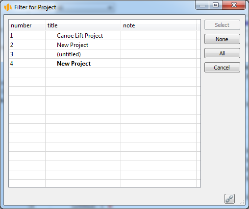
A complete and detailed list of reports available to the user can be accessed via the Edit/Customize… menu.
This opens a window allowing you to modify various settings of the workgroup. As we are currently interested in report customization, select Reports from among the available tabs.
An ordinary user with the Member role, for instance, can only see the Reports tab in the advanced workgroup customization window. Also the range of report operations available to this role is limited.
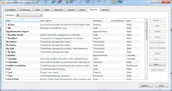
The Reports tab contains a list of all reports that can be displayed in individual workgroup databases and possibly customized.
Setting up a new report
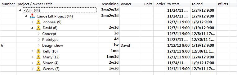
In addition to reports preset by the application supplier, using the Professional license level of Instant Team, you can create your own, user-defined reports. Reports set up in this way will be available only to the user who created them or they can be subsequently shared among other workgroup users (see below the section Other Report Operations, Sharing Reports). In the list of reports, they will then be preceded by an exclamation mark to set them apart. To create a new report, go to the list of all available reports (see Figure 11.1) and press the New… button. Alternatively, select the New… option in the View/Report menu of the main window while any report is displayed.
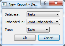
To create a report you first need to fill out a dialog window with three drop-down menus. Their values determine which report will be created. The menus include Database, Embedded in, and Type.
Selecting a database
The value of the "Database" selection box determines what database the new report will relate to, that is, what record information the report will display.
By default, the databases available include Timesheets, iCalendar, Notes and Attachments, Projects, Tasks, Recurrent Tasks, Appointments, Task Templates, Resources, Calendars, and Overview.
When selecting the Tasks database, for example, the newly created report will present task related data.
The Overview database is a special case as it presents data from several other databases together.
Choice of embedding
Reports can be categorized as either “embedded” or “non-embedded”, depending on whether they can be called out directly in a specific database or only within the context of another record.
Non-embedded reports constitute most of the reports. They are available in the main window of the navigation panel. A typical example of a non-embedded report is the report of all existing tasks.
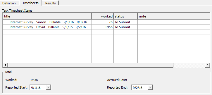
On the other hand, embedded reports, always presenting data in the context of one specific record, can be accessed only via the detail window of the record in one of its tabs. A typical example of an embedded report is the overview of timesheets, which can be found in the Timesheets tab of the task details window, popping up upon a double-click on a specific task.
A special subtype of embedded reports is the lookup report. These are reports prepared by the Instant Team authors that are used for selecting records from various code lists. An example of a lookup report is the table displayed upon selecting a value Lookup… when setting up fields of the project type. Lookup reports can also be customized but new lookup reports cannot be created.
When creating a new report, the option selected in the "Embedded in" drop-down menu defines whether the new report should be accessible directly in the database or only in the context of a specific record.
Selecting a report type
When creating a new report, the last set of options determines the report type. The two main types—the table and the calendar—have been briefly discussed in Chapter 2, section Main Window, Report.
In addition to the table and calendar, two more types of reports can be created—the chart and dashboard.
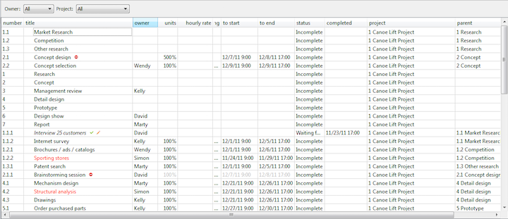
Table is a type of report, where the lines represent individual records. The above examples of both embedded and non-embedded reports are at the same time examples of a table. Apart from row records themselves, the right part of a table can also contain the so-called value line—record values represented as a chart or table, that are usually time-dependent.
List is a report type containing records in a table consisting of a single column. One field may be located left in a row and another may be aligned right. Several fields then may even be under one another. In that case, the second and the following rows are displayed in a smaller font.
Calendar is a type of report where the records are presented in the form of a planning calendar.
Chart is a type of report where numerical values of the records are displayed in the form of a chart.
Dashboard is a type of report, where multiple reports are displayed in one window. Dashboard reports can be grouped in rows, columns or tabs in such a way that the users have the most comprehensive view of the data they are interested in.
After selecting the database, the embedding options and the report type and pressing the Ok button in the new report option settings dialog, the user proceeds to a window where the actual report will be created.
The content of this window will differ, depending on what kind of report is being created. Regardless of the report type, however, the first tab to open is always the Basic tab, where the title of the newly created report needs to be specified. By pressing the Ok button, the new report is created.
Customizing the Table report
This section describes customization options of table type reports as well as general features of customizing reports of the other types. It will be referred to from the other sections of this chapter.
Customization of table type reports, in particular the layout of the report (the Arrangement tab), has already been discussed above in Chapter 10. On the Professional license level, however, additional features can be customized, including the title and description of the report (the Basic tab), report columns (the Content tab), hierarchical grouping of records (the Groups tab), record filtering (the Filters tab), dynamic parameter settings (the Parameters tab), and graphic layout (the Appearance tab).
The report customization options are described according to the individual customization window tabs where the report features are defined. For existing reports, there are several optional ways of opening the customization window.
If a report is opened, you can open the report customization window by simply using the Customize… button in the Format Toolbar or via the View/Report/Customize… menu. An analogous menu is also displayed if you click the right mouse button in an empty part of the report.
The same report customization window also pops up if the user opens a list of all existing reports via the Edit/Customize… menu in the Reports tab, selects a report they want to customize, and presses the Modify… button (or, alternatively, double-clicks the given report).
It is also possible to customize lookup reports, i.e. reports prepared by the application suppliers. However, customization of these reports is limited.
The Basic tab
In this tab, it is possible to modify four basic features of the report—its title, description, the indicator whether the editing field should be available in the report, and the indicator determining how new records should be edited.
Title of the report defines the name of the report to be displayed in lists from which the users can open the reports. This concerns particularly the navigation panel.
Description of the report defines what text is displayed when the user presses <F1> key to activate help for the report.
Display Editors indicator defines whether direct editing of the displayed fields’ values will be enabled in the report. Using the editing zone is discussed in Chapter 2, in the section dealing with record modification.
The Edit new records indicator defines in what way a new record will be created if the user decides to create one while the report is shown. If the “Edit new records” checkbox is ticked, a new row with the new record is added directly to the report when the new record is being created. If the checkbox is not ticked, a separate window pops up when creating a new record by means of which the new record is created. The separate window can pop up even if the box is checked, for instance if the report is filtered in such a way that it would not be possible to display the newly created row. This option is available only in case of table reports with no hidden details—see the Groups tab description below.
The Content tab
In the Content tab, it is possible to define what fields should be displayed in the table columns.
There are two big list boxes in the tab—a list box labeled Hide and a list box labeled Show. All the fields listed in the Show box will be displayed in the report as one of the table columns. By moving a field from the Hide box to the Show box, a new column is added to the report. The other way round, by moving a field from the Show box to the Hide box, the respective column will be removed from the report. To move fields between the list boxes use the arrow buttons « and ». Fields selected by mouse or keyboard will be moved.
It is not only fields of the database, the records of which are presented in the report, that can be displayed; the report can also show values of fields belonging to other databases and related records. To locate the source fields, the values of which should be included in the report, the Location drop-down menu is used.
The default option is always <Here>. It represents the database, the records of which should be returned by the report. Selecting another option in the Location menu results in changes to the Hide list box values, which will now contain fields available in the selected location. The new fields can be added to the Show list box.
If you wish the Timesheets table report to display the author of tasks that the given timesheets relate to then select the "Task" option from the Location drop-down menu and move the "Author.Task" field from the Hide list box to the Show list box.
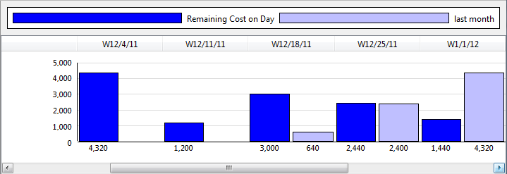
As discussed in Chapter 2 in the general description of the table type report, we already know that some tables can contain the so-called value line in the right-hand part of the report. Whether the value line is displayed and what values are actually presented there, if any, is defined by the option selected in the Values drop-down menu.

Depending on the database type, you can select one of the following options in the Values menu. In case of the Task database:
- Availability—The time remaining to maximum (100
- Gantt chart—A classical project-management representation showing relationships among tasks in a synoptic way. The chart shows the start and end times of the tasks, predecessor-successor relationships between tasks, and resources assigned to tasks. Non-working days and hours are highlighted in gray in the Gantt chart.
- Planned work—Remaining work distributed across the displayed time period. For a manually planned task, work is distributed proportionately to the free capacity of the resource on each day so that the task would be completed on schedule and so that, if possible, the resource would also be available for other tasks every day. If a task is planned automatically then all free capacity is utilized from the beginning of the task towards its end so that the task is finished as soon as possible. When determining free capacity, the values of start and end of the task are taken into account, too. Manually planned tasks are calculated first, making sure that the ones planned automatically do not use up the time assigned to manually planned tasks of the same resource.
- Planned utilization—the scheduled work divided by the capacity and expressed as a percentage (the average value during a period). For time periods with no capacity (i.e., weekends), the value is displayed as “infinite”.
- Peak utilization—the scheduled work divided by the capacity and expressed as a percentage (the maximum value during a period).
- Progress—Change of remaining time for the displayed time period. Negative change (shown in red) means that the task has diverged from the goal. Positive change means that the task has converged to the goal.
- Remaining—Remaining time at the end of the period.
In case of the Timesheets database:
- Done—Accumulated work from the beginning up to the displayed period.
- Work—An effort reported for the displayed period.
- Utilization—Work divided by capacity, shown as percentage. For time periods with no capacity (i.e., weekends), the value is displayed as “infinite”.
If you select the None option in the Values menu, no value line will be displayed in the report; the report will have the form of a table only. If you select the Multiple… option in the Values menu, a new window will pop up where multiple values to be displayed in the value line can be defined. In this way, it is possible to display as many as 20 different indicators at once.
If at least one indicator is selected in the "Selected" box, the report will contain a value line. It is now possible to define whether the value line should display base values only or whether it should reflect also historic values with which the base values will be compared. By selecting the No comparison option in the Compare With drop-down menu, only base values will be displayed.
Selecting the With previous month or With previous year option ensures that the value line will contain data revealing something about the relationship between the base values and the values of the previous month or previous year. What kind of relationship will actually be presented is defined through the How box.
The Style menu contains four options:
- Side by side—The base values and the comparison values will be displayed side by side.
- As percentage—The ratio of the base value to the comparison value will be displayed as percentage.
- Difference—The difference between the base value and the comparison value will be displayed.
- Enhance lower—The base values will be displayed. If the base value is lower than the comparison value, the value will be highlighted.
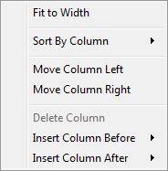
Working with the Professional license level, the report content can be partially customized also using a local menu available for each report column. The local menu allows users to add a new column to or remove an existing column from the report. This can be achieved by using Insert Column Before, Insert Column After, and Delete Column options.
When selecting the options for inserting a new column, a list of all possible columns to be added to the report is displayed. By selecting a column, it will be inserted before or after the column from which the local menu was called out.
The Groups tab
Records can be grouped in a report by values contained in individual fields, forming hierarchical sets or Groups. Record grouping options of a table report can be set in the Groups tab.
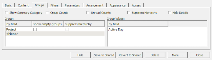
The fields the values of which are used to group the records are specified in the Group table. You can enter values in the By field column if you select all fields the values of which can be used to group the records. If multiple groups are specified then you can move them up and down with the mouse.
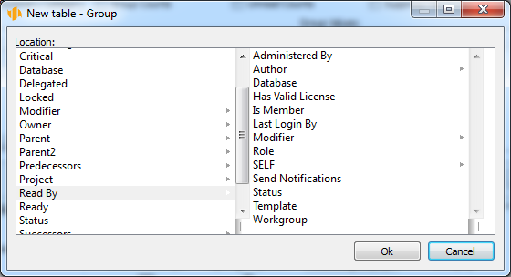
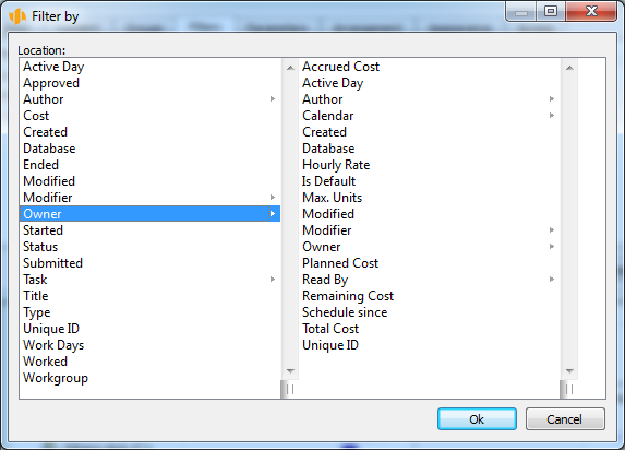
The records can be grouped not only by values of fields from the database for which the report is prepared but also by values of indirect fields from other databases. To choose an indirect field, you select the Indirect… option in the upper part of the field list. Selecting this option will call out a pop-up window with a list of available indirect fields. First, the location of the required indirect field is selected, and then the proper field, by values of which the records should be grouped.
Ticking the checkbox Show empty groups ensures that a group is displayed even if the particular grouping contains no records.
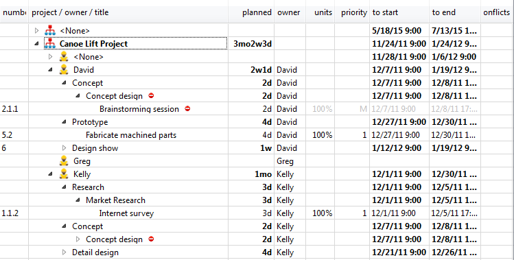
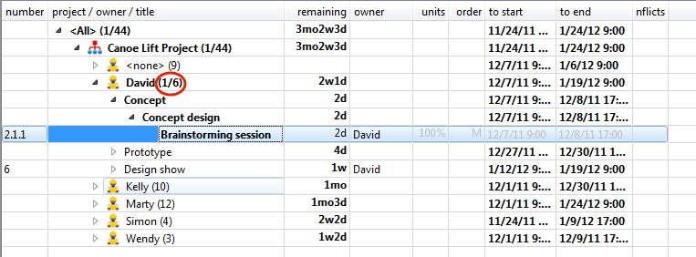
Figure 11.17 shows an example of a task report grouped by projects and then by authors.
There are up to five checkboxes in the upper part of the Groups tab (only four of them are displayed in case of Timesheets database reports):
- Show Summary Category—If this field is checked, the report will
contain the all-including summary group All. By selecting this checkbox,
users can easily determine, for instance, the total time spent by all people
on a specific project.
- Group Counts—If this field is checked, the number of records contained in
each group will be displayed in parenthesis next to the name of the group. By
selecting this checkbox, users can easily determine the total number of tasks for
a specific project. If the Unread Counts checkbox is selected at the
same time, the number of group records will be displayed second in the
parentheses.
If the details of a report are hidden then the number in groups is calculated as the number of groups on the lowest level.
- Unread Counts—If this field is checked, the number of unread records
contained in each group will be displayed in parenthesis next to the name of the
group. By selecting this checkbox, users can easily determine, for example, how
many new tasks there are. If the Group Counts checkbox is selected at
the same time, the number of unread records will be displayed first
in the parentheses, following the name of the group and in front of a
backslash.
- Suppress Hierarchy—This field is applicable only to hierarchical databases, i.e., databases of Projects and Tasks. (You can create subprojects and subtasks, while no subordinate timesheets are possible.) If this field is selected, detailed records are displayed in the form of a non-hierarchical list instead of a standard hierarchical one. In other words, selecting this option will cause, for example, that subtasks will be presented on the same level as their parent tasks.
- Hide Details—If this field is selected, only groups will be displayed in the report, without any individual records. If timesheets are grouped by tasks, for example, selecting this option will cause the report to contain only the summary lines of the timesheets associated with individual tasks.

If the Values menu in the Content tab specifies that the table report should also contain a value line then the Groups tab contains the Group Values table as well. In this table, you can define grouping fields for value line columns in the right part of the report. Again, only options available for grouping purposes will be displayed. You can move groups up and down here using the mouse as well.
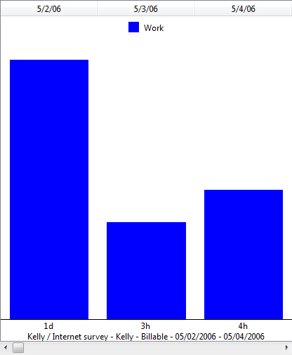
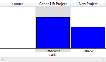
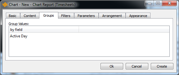
Probably the most frequent option for grouping values on the value line is Active Day. Selecting this option ensures that the displayed values will be grouped on the value line by a time interval and the cells will contain historic values for the given time interval. Figure 11.21 shows an example of daily distribution of planned work related to a specific task.
Analogously, it is possible to group the value line by the progress values or by the volume of work completed on individual days (see Figure 11.22).
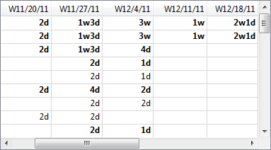
Figure 11.23 gives an example of records grouped by other than time-based attributes; it presents values grouped by the Remaining field of individual projects, visually demonstrating how many hours still need to be spent on the selected projects.
Values presented on the value line can also be grouped by indirect fields using the Indirect… option.
The Filters tab
If required, a report can contain only some specific database records, that is, records meeting specific criteria. The criteria according to which the records will be filtered are defined in the Filters tab.
Multiple filters can be created and combined together. It is possible to combine filters either in such a way that the filter conditions must apply simultaneously, or in such a way that it is sufficient that only one of the filtering conditions is met. In other words, filters can be joined in the logical sense of intersection or union.
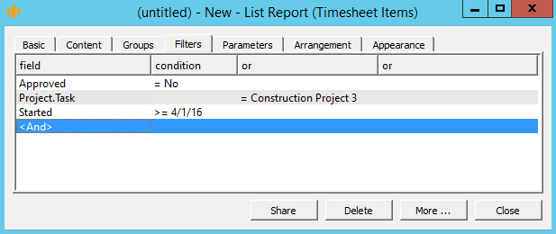
The filtering conditions are defined in the Filters tab of the table. You select a specific Field in the first column; you use the other columns to enter operators and values the given field is to attain. The operator and possible values options are automatically adjusted to the field selected. Figure 11.24 shows an example of a filter condition defining that the report should contain only timesheets starting after 11/9/2014.
In cases where the condition is defined by fields which can take only a limited set of values, the operator is not used at all. Instead, a drop-down menu with the respective set of values appears. This applies, for instance, when defining conditions based on task status values, Boolean Yes and No values or in conditions using a reference to other records, such as resources, projects, etc.
Using filters based on the value of Me, it is possible to create personalized reports presenting content relevant to each user.
The value of Me has the meaning of both the current user and also of any resource associated with the current user.
Thanks to the Me value, it is possible, for example, to display a report of all my tasks (i.e., tasks owned by any of the resources assigned to myself) or all my timesheets (i.e., timesheets where I am the author).
As an analog of the Me value, there is an option enabling you to filter only those records that have a certain field matching the value of the field in your user record. This is on condition that the field exists in the user database.
For instance, if you added a user field City to the user database and if you created a customer database also including the City field then you could create a report of customers belonging to the same city as you. You would then set the filter as follows:
field = City
condition = Equal to my entry City
When defining conditions using fields which can take unlimited range of values, the following operators are available:
- Any value—The condition is met when the field takes any value, including null.
- Is less than or equal to—The condition is met if the field value is lower than or equal to the value specified in the condition. In case of a date or time field, the condition is met if the field contains an earlier date or time than the date or time specified in the condition or if the field contains the same date or time as specified in the condition.
- Is less than or equal to today—The condition is met, if the field value contains today’s date or an earlier date.
- Is less than—The condition is met if the field value is lower than the value specified in the condition. In case of a date or time field, the condition is met if the field contains an earlier date or time than the date or time specified in the condition.
- Is less than today—The condition is met if the field value contains an earlier date than today’s date.
- Is equal to—The condition is met if the field value is equal to the value specified in the condition. In case of a date or time field, the condition is met if the field contains exactly the same time value as specified in the condition definition.
- Is equal to today—The condition is met if the field value is equal to today’s date. This filter can be used, for instance, for definition of all tasks to be completed today.
- Is in the previous period—The condition is met if the field contains a time value falling within the last calendar week, month, quarter or year. Thus, in case of a week, records with the field value from the last Monday to the last Sunday will be displayed in the report.
- Is in period up to today—The condition is met if the field contains a time value falling within the period of one week, month, quarter or year antecedent to today’s date. In case of a week, for example, records with the field value within the previous 7 days will be displayed in the report.
- Is in period since today—The condition is met if the field contains a time value falling within the period of one week, month, quarter or year starting today. In case of a week, for example, records with the field value within the next 7 days will be displayed in the report.
- Is in the next period—The condition is met if the field contains a time value falling within the next calendar week, month, quarter or year. In case of a week, for example, records with the field value from the next Monday to the next Sunday will be displayed in the report.
- Is in range—The condition is met if the field contains a time value falling within the time period between two calendar days, including these days.
- Is in range from to—The condition is available for the fields types number, percentage, time, day, and duration. The condition is met if the field value falls within the interval between the two specified values, including the values. Other options include the conditions Is in range from to including, Is in range from including to, and Is in range from including to including. These variants differ in the fact whether the field value is to fall within the from-to period including or excluding the separate end points.
- Is in this period—The condition is met if the field contains a time value falling within the present calendar week, month, quarter or year. In case of a week, for example, records with the field value from Monday of the present week to Sunday of the present week will be displayed in the report.
- Is greater than or equal to—The condition is met if the field value is greater than or equal to the value specified in the condition. In case of a date or time field, the condition is met if the field contains a later date or time than the date or time specified in the condition or if the field contains the same date or time as specified in the condition.
- Is greater than or equal to today—The condition is met if the field value contains today’s date or a future date.
- Is greater than—The condition is met if the field value is greater than the value specified in the condition. In case of a date or in case of a date or time field, the condition is met if the field contains a later date or time than the date or time specified in the condition.
- Is greater than today—The condition is met if the field value contains a future date, that is, a date later than today’s date.
- Is not equal to—The condition is met if the field value differs from the value specified in the condition. In case of a date or time field, the condition is met if the field contains a different time than specified in the condition definition.
- Contains—This operator is only available for text fields. When using this operator, the condition is met if the given text field contains the specified string of characters.
You can access the recently used filtering conditions directly in the lower part of the pull-down list where you select the filter type.
Filter conditions specified in one column must be met at the same time. There is the “or” relationship between conditions specified in multiple columns.
In addition to selecting a field from the current database, it is possible to select the option Indirect… in the Field menu. Selecting this option calls out a pop-up window, in which filter conditions can be defined using fields of related records from other databases.
Where the filter condition is defined using a hierarchical value, such as a project, the condition is met also if the filter field contains descendants of the selected value. In case of a project, for example, applying the condition will return records with the filter field containing not only the project selected in the condition but also all subprojects of this project.
The Parameters tab
Dynamic filtering options of a report can be specified in the Parameters tab. Using this tab it is possible to place drop-down menus and calendar boxes in the Format Toolbar of the customized report. The drop-down menu and calendar box values represent parameters according to which the report is filtered.

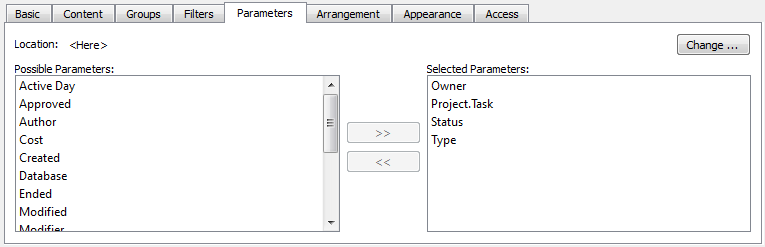
In the same fashion as in the Content tab, the fields to be displayed in the Format toolbar for the purposes of report parametrization are selected from the list of all Possible Parameters and moved to the list of Selected Parameters. To move fields between the list boxes use the arrow buttons « and ». Fields selected by mouse or keyboard will be moved.
If the report parameter is the Database field then it is displayed in the form of check boxes for the individual databases.
Again, the user is not limited to selecting fields from the current database only. Using the Location drop-down menu, it is possible to choose parameters also from related records of other databases.
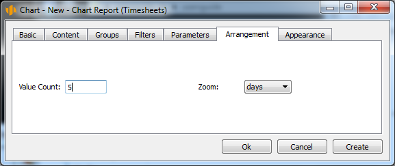
The Arrangement tab
This tab is used to define the arrangement structure of the records displayed in the report. Arrangement options are described in detail in Chapter 10.
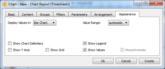
The Appearance tab
The Appearance tab makes it possible to set graphic layout options of the report.
The Value Representation selection field defines how data are represented on the value line. If you select the value Table then the values will be displayed in the form of numbers. If you choose another value then the values will be displayed in the form of a graph of one of the types described below.
To select fields used for the beginning and end of tasks in Gantt chart, use two selection fields Start and End. Additionally, in Baseline Plan reports, there are analogous fields available: Baseline Start and Baseline End.
The menu of the fields Caption left and Caption right enables you to choose data that will appear to the left and to the right from the graphical representation of tasks in Gantt chart.
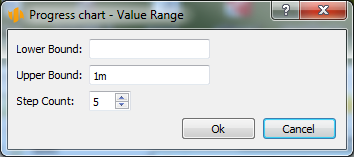
For bar-, line-, and level charts, you can set the value range manually. These graphs enable the Value Range selection field. The default value of the field is Automatic (the value range is calculated automatically). If we choose the value Other a window opens where you can enter the lower and upper limits and the number of steps.
There are several other checkboxes available. By checking or unchecking them, the graphic layout of the report changes.
- Column Delimiter—This checkbox turns on and off the vertical delimiting lines between report columns.
- Row Delimiter—This checkbox turns on and off the horizontal delimiting lines between report rows.
- Show Legend—This checkbox enables you to show the caption above a displayed chart or Gantt chart. This option is available only if the checkbox Show as Bar Chart is ticked and it makes sense at the same time to display the legend (if there are at least two different values displayed or in case of a Gantt chart).
- Show Chart Delimiter—This checkbox turns on and off the vertical delimiting lines between columns in a Gantt chart.
- Show Y Axis—If this checkbox is ticked then the vertical axis, Y, will be displayed in the charts, showing numerical value levels. The option is only available if the Value Display selection field specifies a bar-, line- or level chart.
- Show Grid—If this checkbox is ticked then charts will show a grid indicating numerical value levels of the displayed values. The option is only available if the Value Display selection field specifies a bar-, line- or level chart.
- Optimize gaps between verticals—This option turns on and off optimization of spaces between vertical lines in a chart. The option is only available for the Gantt chart.
- Show hidden arrows—This option turns on and off the gray arrows in the Gantt chart, representing the predecessor–successor relations.
- Show current time—This option turns on and off the vertical red line indicating the current time in the Gantt chart.
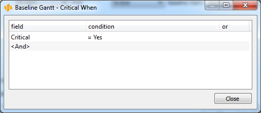
- Highlight critical—This option turns on and off red-color emphasis on
critical tasks. The option is only available for the Gantt chart. If the option
is on then it is possible to set other conditions to highlight critical tasks.
To do that, use the Specify… button, which opens the following window to
define the conditions.
Customizing the list report
List reports can be customized using the Basic, Content, Groups, Filters, Parameters, Arrangement, and Appearance tabs. We only briefly mention the customization options in the Basic and Appearance tabs, which differ from the table report customization options.
The customization window can be opened in the same way as in case of a table report.
The Basic tab
The list report does not allow you to edit values directly. Therefore, the Basic tab lacks the Display editing zone and Edit new records check boxes.
The Appearance tab
Due to the fact that the list report always has just a single column the Appearance tab lacks the Column delimiter check box.
Customizing the Calendar report
Calendar reports can be customized using the Basic, Content, Filters, and Parameters tabs. Except for the Basic and Content tabs, the customization possibilities of the individual tabs do not differ substantially from the customization options of a table report described above. We will thus only focus on customization options within these two tabs.
The customization window can be opened in the same way as in case of a table report.
The Basic tab
The Basic tab of a calendar report includes the Zoom field determining what time period should be displayed on the screen or printed on one page. In one view, it is possible to display a calendar for an entire year divided into individual months or only a quarter by months or one month or one week by individual days or one day only.
The Content tab
The Content tab makes it possible to define in what date fields of the calendar the individual records should be presented.
This definition is made using the Link by drop-down menu, which can be used repeatedly. The menu options include all date fields of the database the records of which are displayed in the report.
In the task database, for example, if the field To Start is selected in the Link by drop-down menu, the individual tasks of the calendar report will be displayed according to their planned starting date.
Customizing the Chart report
Chart reports can be customized using the Basic, Content, Groups, Filters, Parameters, Arrangement, and Appearance tabs. Only those customization options are discussed which differ from the table report customization options.
The report customization window can be opened in the same way as in case of a table report.
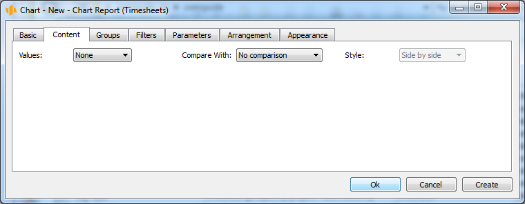
The Content tab
To define chart content means to specify what values should be displayed in the chart. Chart content definition is similar to the definition of a value line displayed in a table report—see above.
The Groups tab
Using the Groups tab, fields by which the values should be grouped are defined. Grouping definition is similar to definition of grouping options of a value line displayed in a table report—see above.
The Arrangement tab
This tab is used to define the layout of the records displayed in the report. Arrangement definition is similar to the definition of arrangement options of a value line displayed in a table report—see above. The only difference is that it is not possible to define the value width and the number of charts displayed per page.
The Appearance tab
Graphic layout options of the report are specified in the Appearance tab. The definition is similar to that of the table report—see above. The only difference is that no column or row delimiters can be set for a chart. It is however possible to display vertical separators in charts, which are vertical lines separating, for instance, columns for the individual time periods.
The Value display drop-down menu enables you to select one of the following types of charts.
Bar chart—Displays values using rectangular strips the proportional height of which corresponds to the magnitude of values they represent. A bar chart is used, for example, in the Utilization report, see Figure 5.9.
Line chart—Shows values as points of the Y axis. Values in each data series are connected by a line.
Level chart—A special version of the line chart, which draws all the lines horizontally. A level chart is also used in the Utilization report, see Figure 5.9.
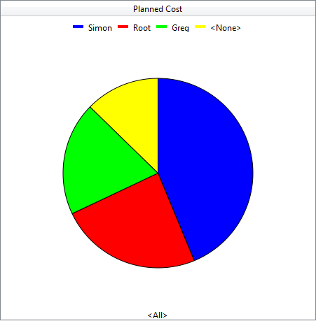
Pie chart—A pie- or circular sector chart displays the magnitude of the individual entries in a data series in proportion to the sum of all entries as a sector of a circle. The area of the circle represents the entire data series. Its separate parts are represented by the individual circular sectors. The individual sectors are set apart by colors. 360° represents 100%. A sector of a circle with a central angle of 3.6° thus occupies 1% of the total. The active pie sector is always pulled out of the pie. By setting the number of values in a report, you can determine how many values will have a separate sector—the rest will fall within the "Other" sector. You cannot use the pie chart if the values are grouped by time.
Gauge—This type of chart always displays individual values only. Like the other charts, the Gauge type chart also determines the value range automatically. Additionally, the scale used to divide the values to fit within the gauge is also determined automatically. You can use the coloring rules for a particular field to specify the range of values to have green background color in the gauges. The Gauge type chart is used, for example, in the project window in the Baseline plan tab, see Figure 6.11.
Detailed bar chart—This type of chart is only available when values are grouped by time and it works as an ordinary bar chart apart from the fact it displays values from the given period that are one level more detailed than the report detail. Thanks to that, you can display many more time values simultaneously.
Detailed line chart—This type of chart is only available when values are grouped by time and it works as an ordinary line chart apart from the fact it displays values from the given period that are one level more detailed than the report detail. Thanks to that, you can display many more time values simultaneously.
Detailed level chart—This type of chart is only available when values are grouped by time and it works as an ordinary level chart apart from the fact it displays values from the given period that are one level more detailed than the report detail. Thanks to that, you can display many more time values simultaneously.
Combined…—Bar-, line-, and level charts can be combined. To combine charts, select the Combined… option, which opens the following window.
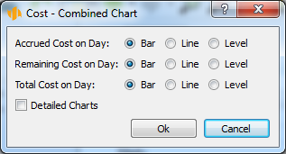
With some types of charts (e.g., the bar chart), it is possible to turn off the displayed values using the Display values option. These are then not plotted in the chart and they are only displayed (including the name of the value) when the mouse hovers over the chart.
Customizing the Dashboard report
Dashboard reports can be customized using the Basic, Content, and Arrangement tabs. Only those customizing options of the Content and Arrangement tabs are discussed which differ from the table report customizing options.
The customization window can be opened in the same way as in case of a table report.
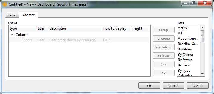
The Content tab
Using the Content tab, you define which reports will be included in the Dashboard and set their layout, primarily their logical grouping and screen layout.
Reports to be displayed in the dashboard are moved to the Show list. Other reports are left in the Hide list. It is possible to display a report from any database. You cannot display the navigation panel or the built-in reports to select values. Reports in the Show list are combined into groups, see below. To move reports between the list boxes use the familiar arrow buttons « and ». Fields selected by mouse or keyboard will be moved. When a report is moved to the Show list the report is inserted into the group which is active in the list. If you select multiple reports, you can move them at the same time. If you select a group in the Show list then the entire group will be removed.
In addition, there is the Duplicate button between the two lists. Using this button, you can create a duplicate of the displayed report so that the report can be displayed multiple times in the Dashboard at different places. The new report is inserted into the group where the original report was. It is also possible to duplicate an entire group at once. When duplicating an item, the height, name, description, and display options are copied as well.
The reports can be aggregated to form logical groups using the Group and Ungroup buttons. By selecting multiple reports and pressing the Group button, the selected reports will form a group. By pressing the Ungroup button with a group selected, the grouped reports will split.
Dragging reports up and down with the mouse, it is possible to define a sequence of reports to be displayed in the resulting dashboard. Moving a report up, you can shift it forward in the dashboard and, vice versa, moving it down, you can shift it backward.
Subsequently, a type and possibly also a name and description can be specified for each report group.
To activate these additional group options, first select the appropriate report group. The groups displayed in the main box of the tab are preceded by the “-“ collapsed sign.
Report grouping can be of the type Row, Column, Section, Tabs or Shared time line. If the option Row is selected in the Type column, reports will be grouped horizontally. If the option Column is selected, the reports will be grouped vertically. Sections are displayed under one another with a prominent delimiter and they can be hidden individually. The option Tabs groups the reports as tabs. The shared time line links several reports to the time line to guarantee they always show the same period of time. Reports with a shared time line will be displayed above one another.
It is also possible to name the report groups as needed. To set the name, use the appropriate field in the Title column. If a group with a name (a group with its name filled in) is embedded in a Tab type group then its name is used as the name of the tab corresponding to the group. Otherwise, the group is visually set apart when displayed (using a frame around group content) and its name is shown as a title of this visually separated group.
If a user requests context help for a specific report group, the text entered in the appropriate field in the Description column is displayed.
To set the height of a report, use the appropriate field in the Height column. The height of a report means the number of displayed lines. If the height of a report is specified, the number of displayed lines will always be fixed. If no height of the report is specified, the number of lines will be set automatically by the system.
Customizing an embedded report
Embedded reports can be customized in a similar manner as regular reports.
Only the Filters tab options are described in more detail here as this is where links of the embedded report to the context in which the embedded report should be displayed can be defined.
The customization window of an embedded report can be opened in the standard way using the Edit/Customize… menu. The Reports tab displays a list of all existing reports here. You select an embedded report requiring customization and use the Modify… button (or, alternatively, you double-click on the given report).
When a report is open you can also open the embedded report customization window by using the Customize… option in the local menu, which opens when you click the right mouse button anywhere in an empty part of the report.
The Filters tab
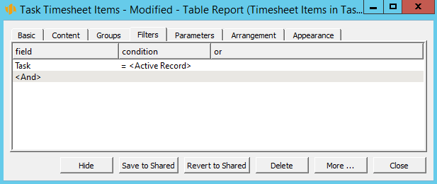
Using the Filters tab one can define through which field the embedded report records should be linked to the record in the context of which the embedded report is displayed.
The linking field is usually defined first by selecting a field of the records being displayed from the Field pull-down menu; in the context of this field the embedded report records will be displayed. Then the condition “is equal to active record” is selected.
Taking the example of the Timesheets for a Task report embedded in the Tasks report then the linking field is the field containing the task identifier. In other words, the Timesheets for a Task report will only display those timesheets where the Task field contains the value of the currently displayed task.
Using the Indirect… option in the upper part of the pull-down list of fields, you can also define the linking field using indirect contextual fields from reports from other databases.
Other report operations
In addition to creating and customizing reports, the Reports tab—available via the Edit/Customize… menu—enables you to perform all other report operations.
To perform a report operation, you use the buttons located in the right part of the window with the list of reports (see Figure 11.1).
If a button is gray it means the specific operation cannot be performed with the selected report.
List of available reports
Not all reports are displayed in the same way in the list of existing reports, which can be accessed via the Edit/Customize… menu in the Reports tab.
Bold reports are original reports delivered together with the application.
Reports preceded with an asterisk (*) are reports modified by the current user. These are reports customized by the user for their own needs. If the user is not satisfied with the current customization, they can return to the original shared version of the report at any time.
Reports preceded with an exclamation mark (!) are private reports which are not shared. These reports were created by the current user for their own needs. The other users (not even the administrator) do not see these reports.
Reports in parentheses are hidden. These reports cannot be selected from the regular menus with available reports.
Hiding and unhiding reports
The hide report function enables you to remove temporarily the selected reports from the menu of available reports. Only shared reports can be hidden and unhidden.
To hide a report, first highlight it with the mouse or keyboard in the list of reports and then press the Hide button. The report will be removed from the report menu. In the list of reports, hidden reports are presented enclosed in parentheses.
Vice versa, if a hidden report is to be displayed in the menu of available reports again, the hidden report is selected and unhidden by pressing the Unhide button.
Hiding and unhiding reports affects only the user who performs this operation.
Sharing reports
This functionality is only available to users with the Administrator role. It enables to publish a newly created report for the entire workgroup.
The report to be shared within a workgroup is first selected from the list of reports using the mouse or keyboard and then you press the Share button. All the users will then be able to work with the report.
Once a report is shared, it is no longer possible to “unshare” it. However, it is possible to hide or delete the report at any later time.
Publishing report customizations
The functionality of publishing report customizations makes it possible to share an individual customization of a report by a specific user within the workgroup.
Publishing report customizations is controlled through the Save to shared and Reset shared buttons. Only users with the Administrator role can publish their report customizations.
Publishing report customizations is addressed above in Chapter 10, section Sharing Customization.
Copying reports
The functionality of copying reports makes it possible to generate new reports by creating a copy of an already existing report.
A copy of an existing report can be created in two ways. Either by selecting a report to be copied in the list of all available reports (see Figure 11.1) and subsequently pressing the Copy… button, or by selecting the View/Report/Copy… option in the main window menu. In the latter case, a copy of the currently displayed report will be created.
Subsequently, it is possible to customize the newly created copy as required.
Default reports
This functionality is available to users with the role of Administrator. It enables you to set a selected report as the default report for its database. That means the report is displayed to users when opening this database for the first time. The default report in the navigation panel represents all reports from the given database. All other reports are embedded in it in the navigation panel.
A report is first highlighted with mouse or keyboard in the list of reports and then made default by pressing the Make default… button.
Deleting reports
A report which is no longer needed can be permanently removed.
A report to be removed is first highlighted with mouse or keyboard in the list of reports and then deleted by pressing the Delete button.
Users with the role of Member can delete only reports they created. Users with the role of Administrator can delete any report available to them, except for lookup reports, i.e., reports necessary for regular operation of the application itself.
60 days overview of all dates, capacities, inputs and outputs about each project and completely free.
All rights reserved, Created by eBRÁNA Privacy statement